Shepherd Money required a fresh approach to financial app design. This case study explores how I figure out an intuitive solution to harmonize AI capabilities and established financial management features.
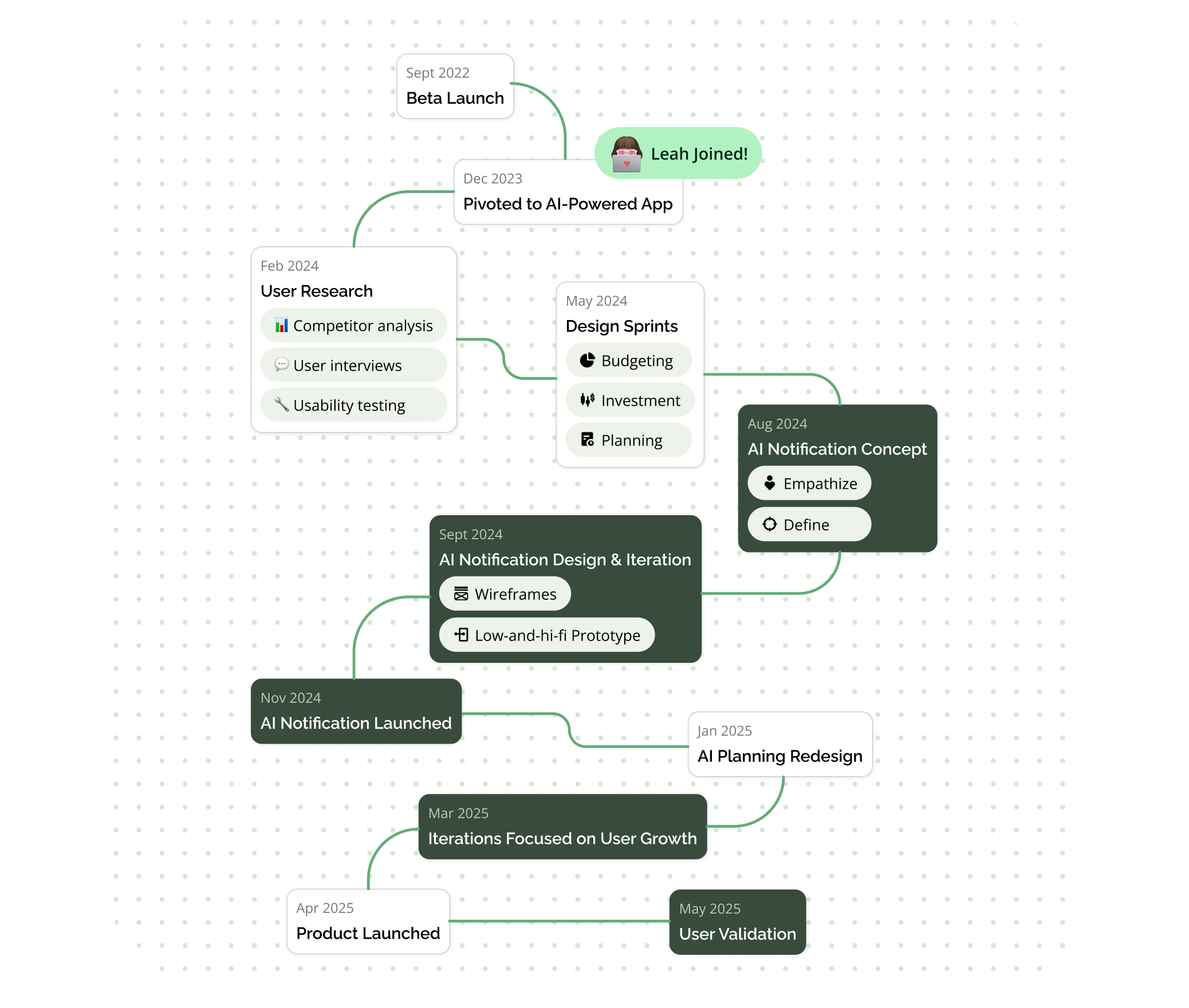
1.5 Years (Dec 2023 - May 2025)
3 Developers (Co-founders)
1 Product Manager
2 Product Designers
1 Illustrator
Shepherd Money was founded in 2022 by three engineers with a vision to bridge a market gap—creating a powerful yet user-friendly financial management app powered by AI.
In 2023, I joined their design team, I was initially tasked with a UI revamp (View case study) and a redesign of the AI Copilot page. However, I quickly realized that improving isolated AI page or UI elements wouldn’t be enough—the entire user experience requires a more holistic optimization to make AI truly intuitive and valuable for users.
Skip to Final Design
Delivering fresh content daily both AI-generated and team-curated. We encourage users to return regularly, discover timely insights

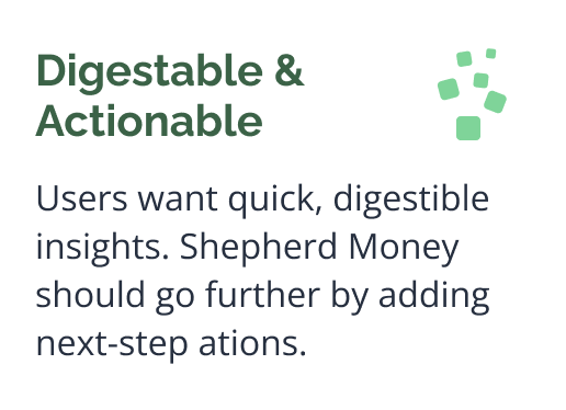
Proactive, personalized insights designed to be easily digestible — encouraging users to engage with AI from the start
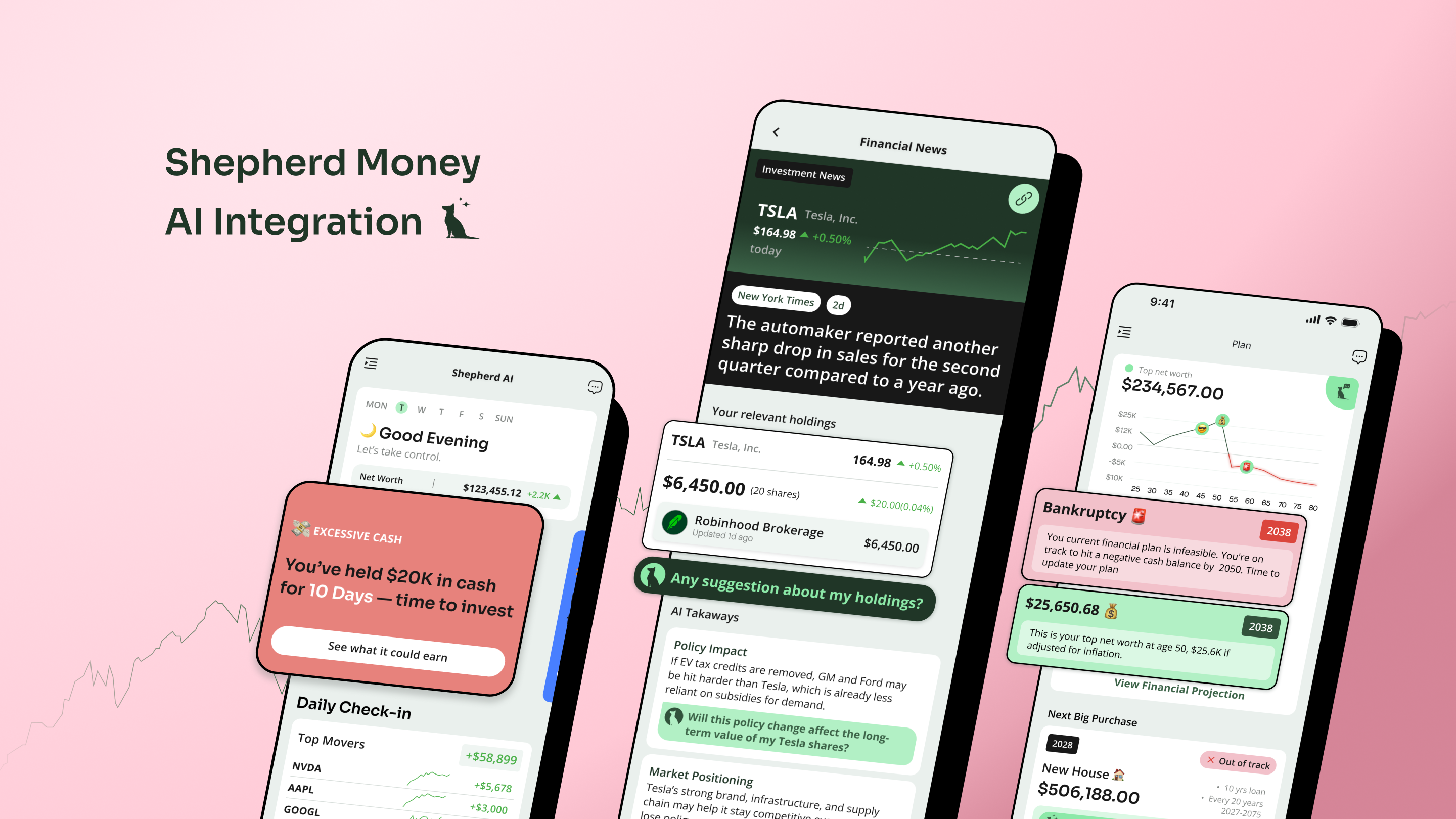
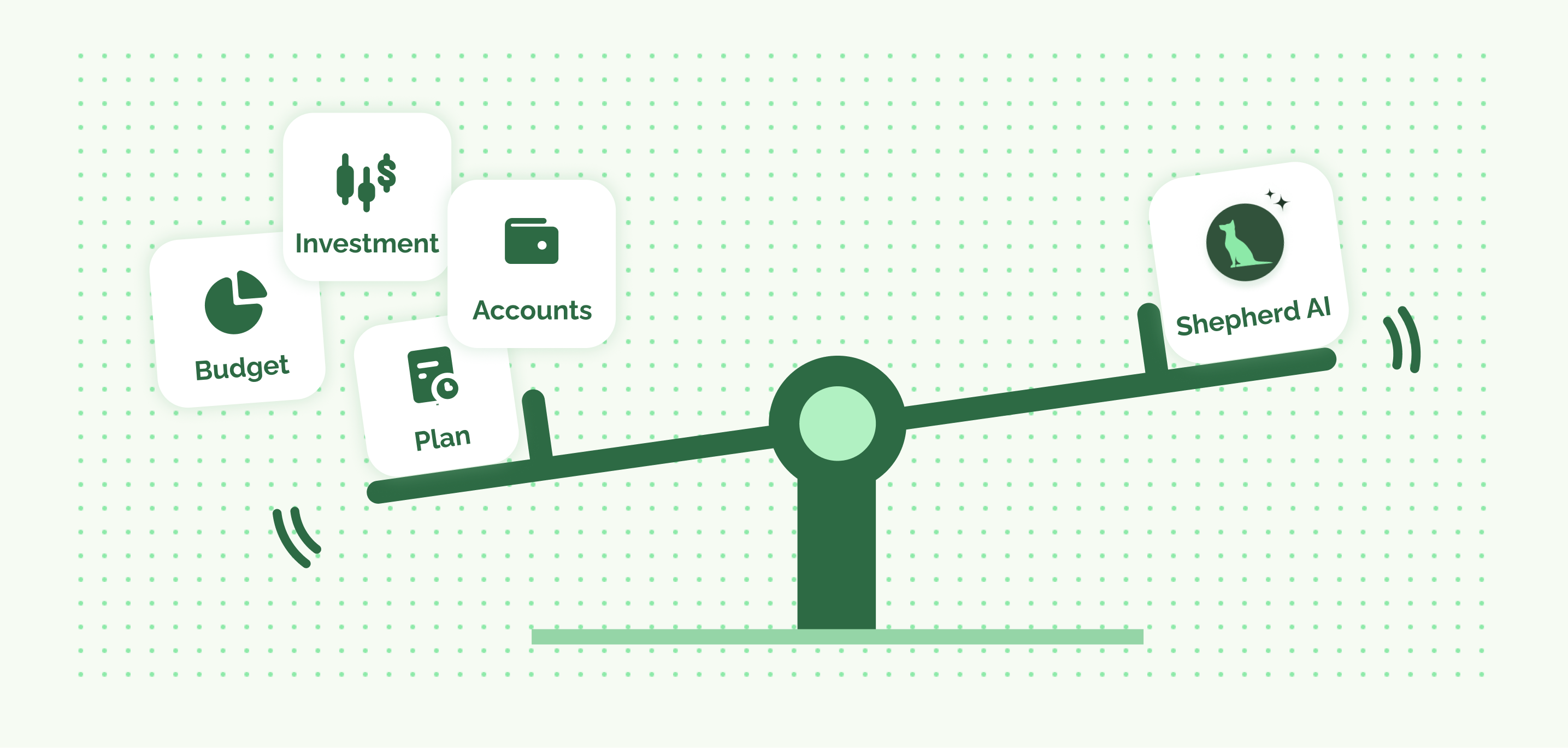
I joined the team for AI related features and we've explored several AI integration in core financial functions, but in this case, I'll focus on how we created our key differentiator - the AI Notification.
I created personas and user journeys to clarify who we were designing for, uncover their pain points, and align the team on how Shepherd Money’s AI could bring unique value to their financial decisions.
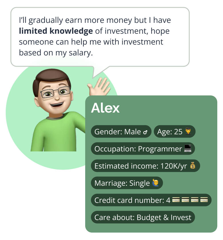
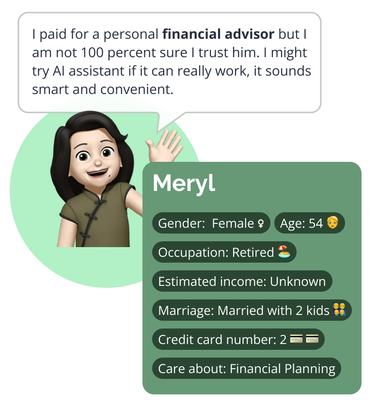
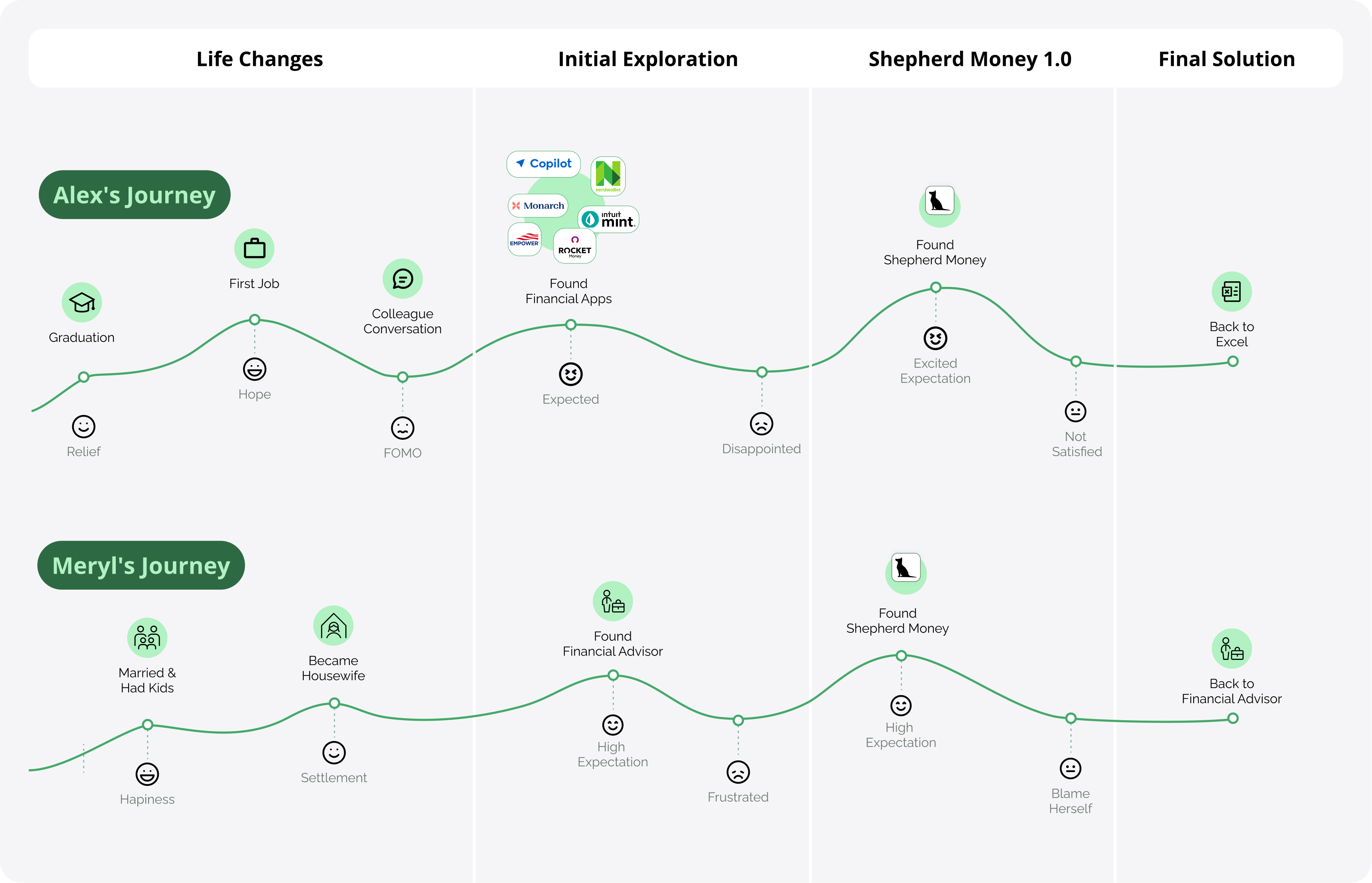
Both Alex and Meryl came to Shepherd Money hoping AI could provide the clarity they couldn’t find elsewhere. But without clear guidance on how to interact with the AI, they quickly felt lost—sometimes even blaming themselves—and ended up treating the app like any other traditional tool.
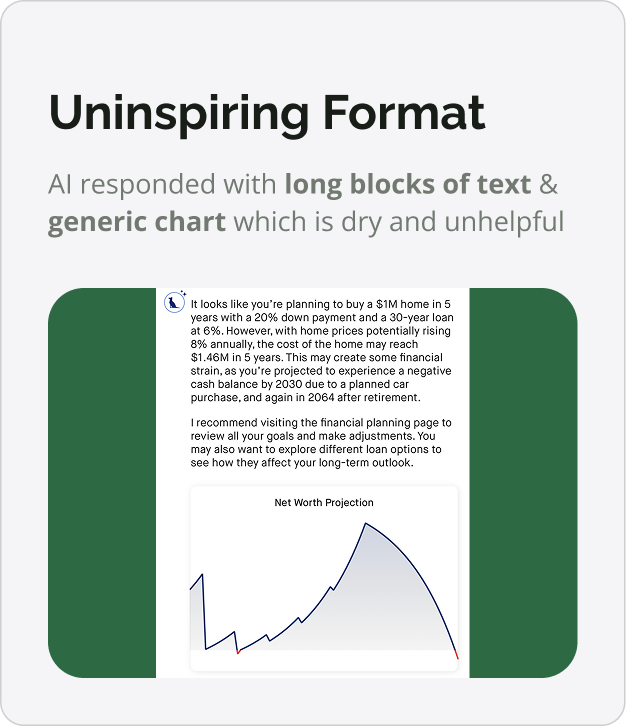
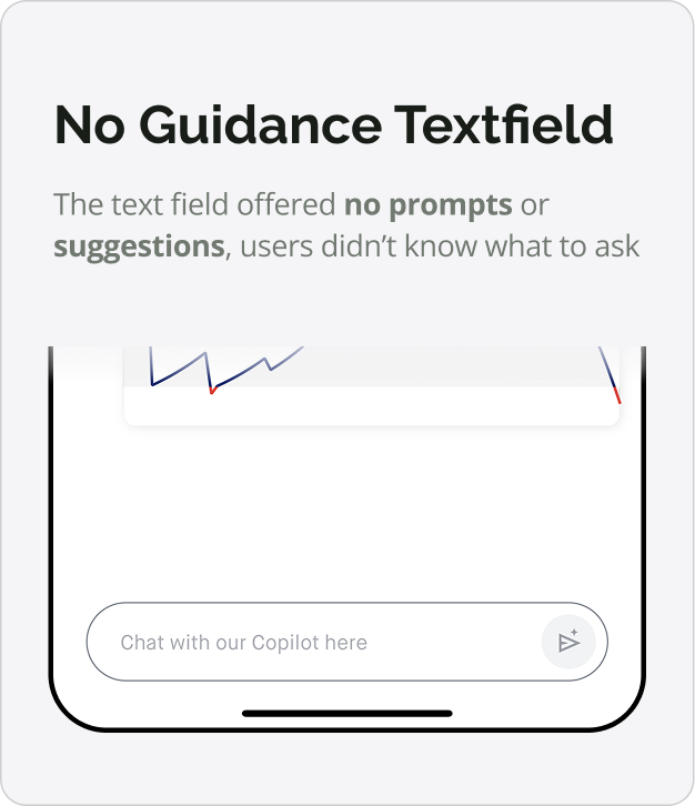
We did 8 user testings with Shepherd Money initial version of AI implementation, soon realized that nearly all of them have no idea what to ask AI without guidance. But after I told them what AI can achieve, they think AI is super helpful for financial planning.
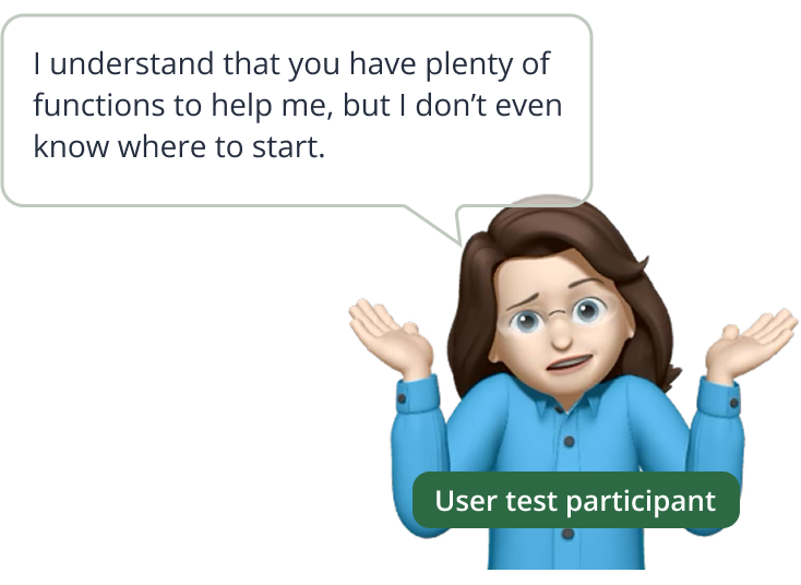
A single AI chat couldn't solve anything, the team assume it could handle everything while users passively consumed the rest. It quickly became clear that the real challenge was finding the right balance between AI guidance & essensial information.
We started by testing quick directions to understand how users might best interact with AI.
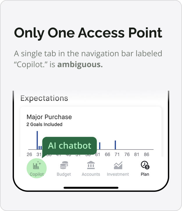
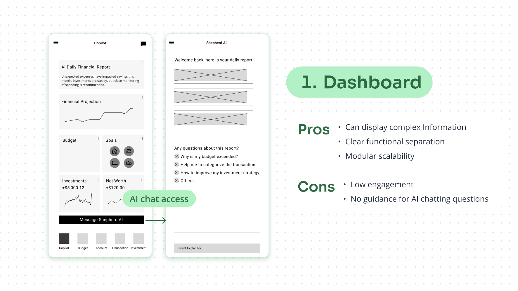
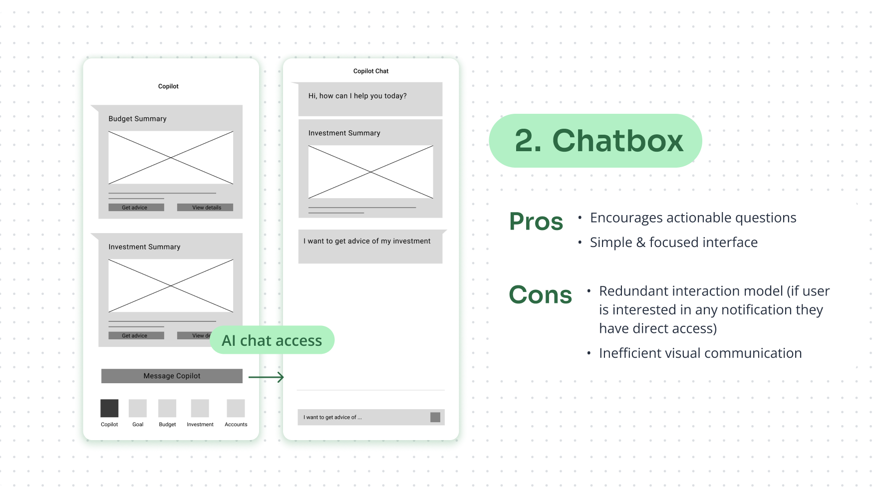
Shepherd Money's first attempt at integrating AI was a standalone chatbot tab. It looked functional on paper, but in practice it failed to create engagement.
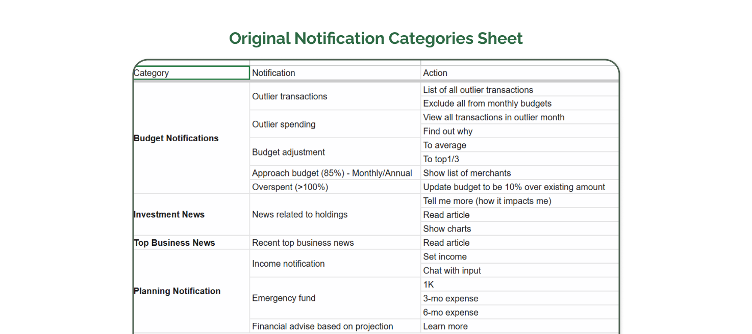
Our PM still noticed something valuable: the few questions users did ask revealed clear patterns. Users were often circling around the same themes—budgeting, planning, investments, and spending habits.

This led us to ideate on how we could utilize these recurring questions to present information users would be interested in—before they even ask.
By analyzing clustered themes, we uncovered a new way to present information: rather than waiting for input in a chatbox, we transformed these insights into alerts, news, and proactive recommendations.
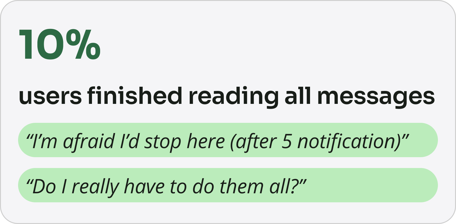
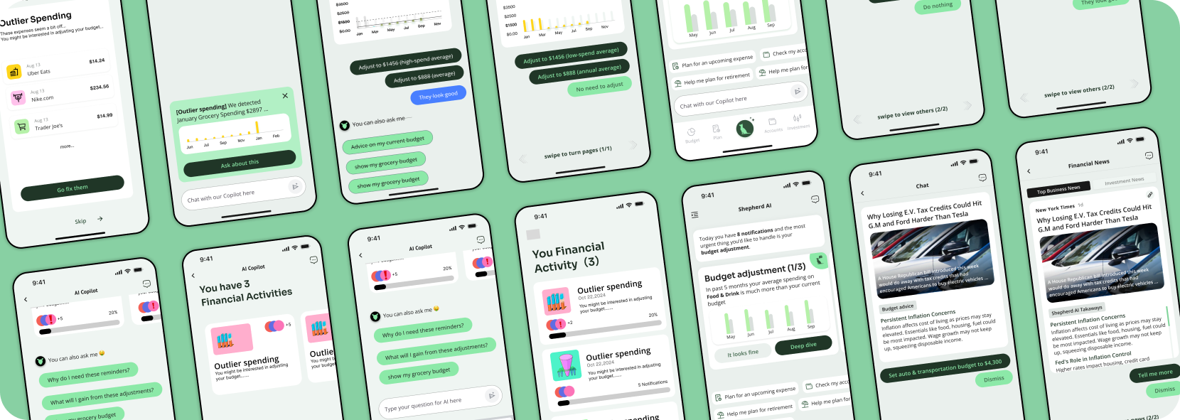
To rapidly test interest, we built a lightweight prototype by placing all notifications sequentially in the AI chat interface, marked with pagination (e.g., 1/13).
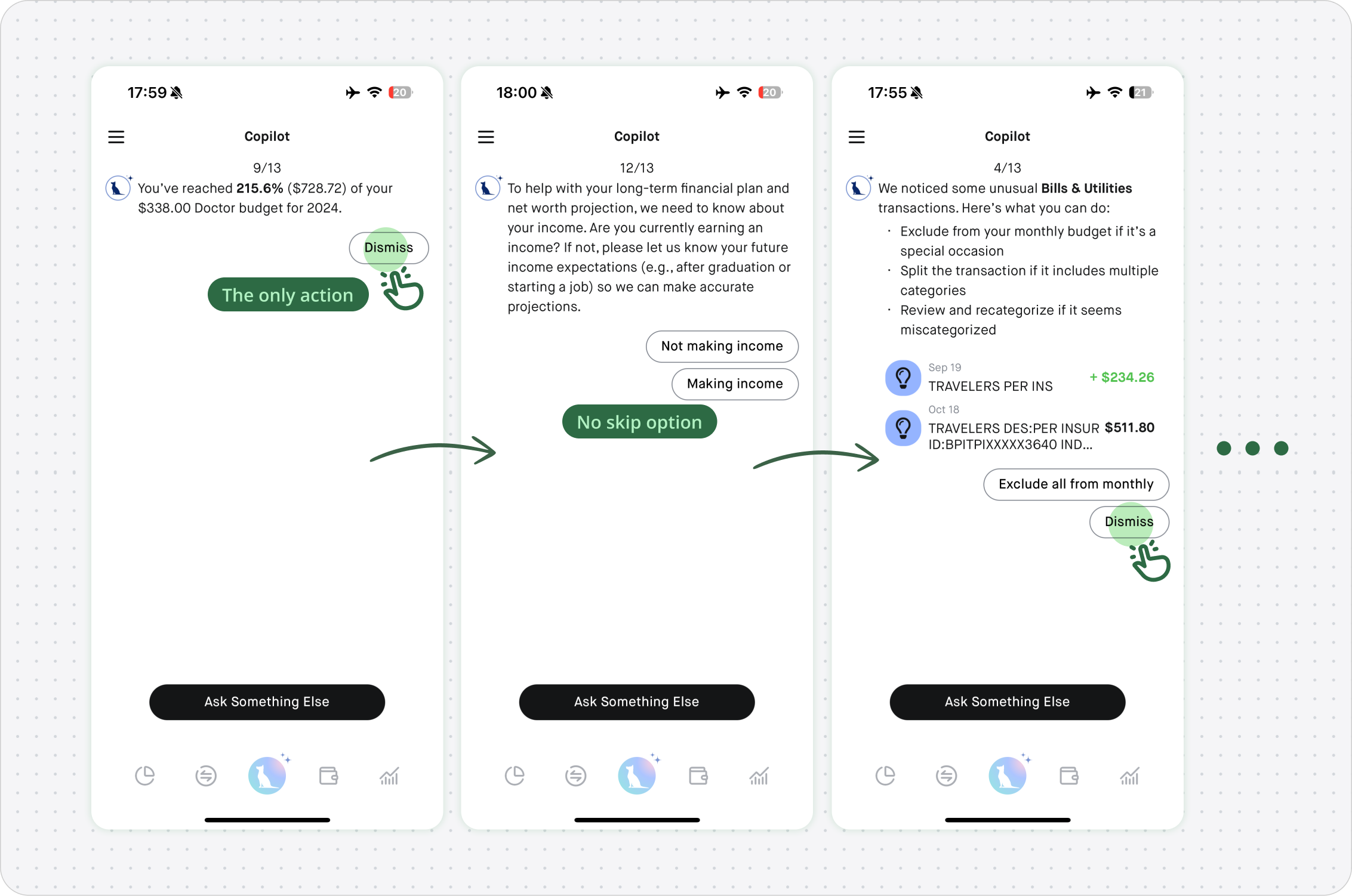
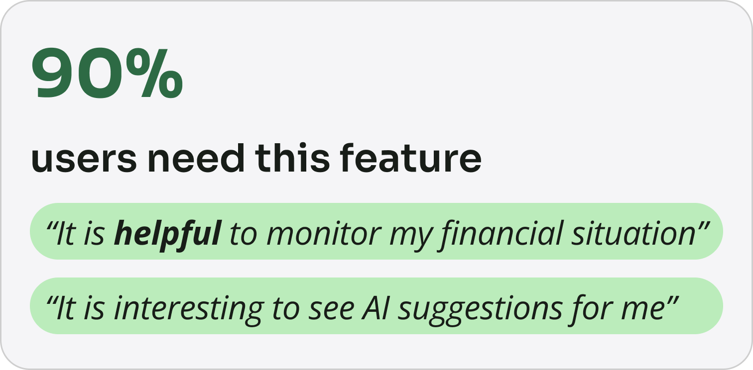
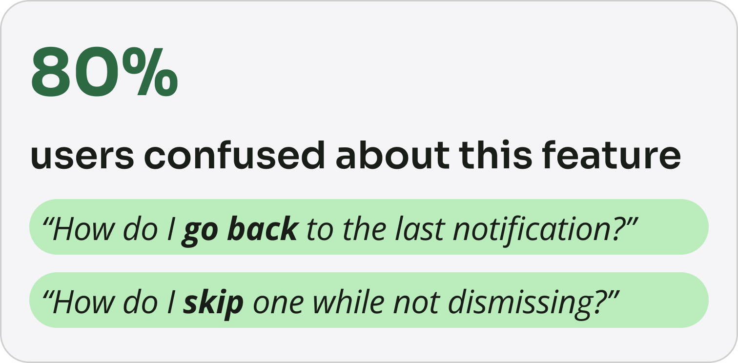
10 users partcipated in our user testing. While this rapid prototype was well-received — users appreciated having a tool to monitor irregular financial activities but many found the interaction confusing. They weren’t sure how to navigate between notifications or what actions to take next.
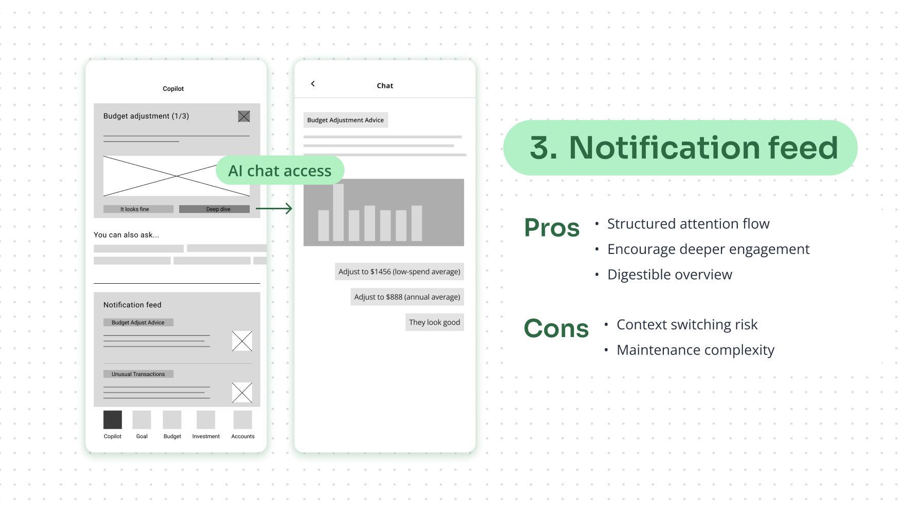
Building notification feature, I created three proposals: a dashboard, a chatbot, and a notification feed. Each had its pros and cons, which we evaluated together as a team.
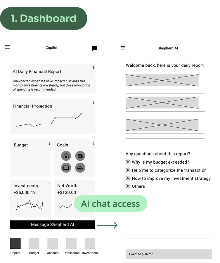
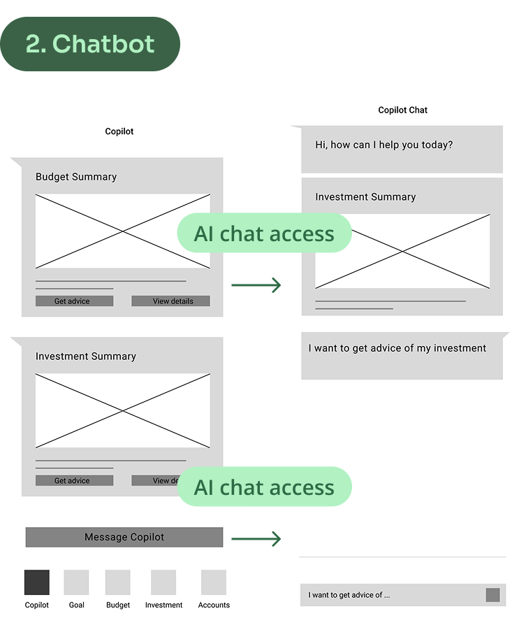
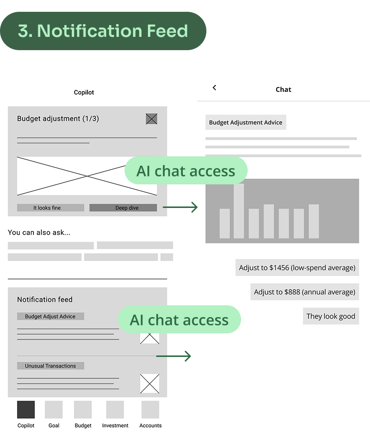
Initially, the PM and I evaluated the pros and cons of each direction. We both found the chatbot style compelling for its conversational flow, while the notification feed stood out for its readability and scanning efficiency. The dashboard approach, in contrast, felt less engaging and lacked a clear point of interaction.


How do we choose the best one? I mapped the three proposals on a coordinate system, with Information Richness on the vertical axis and User Involvement on the horizontal.
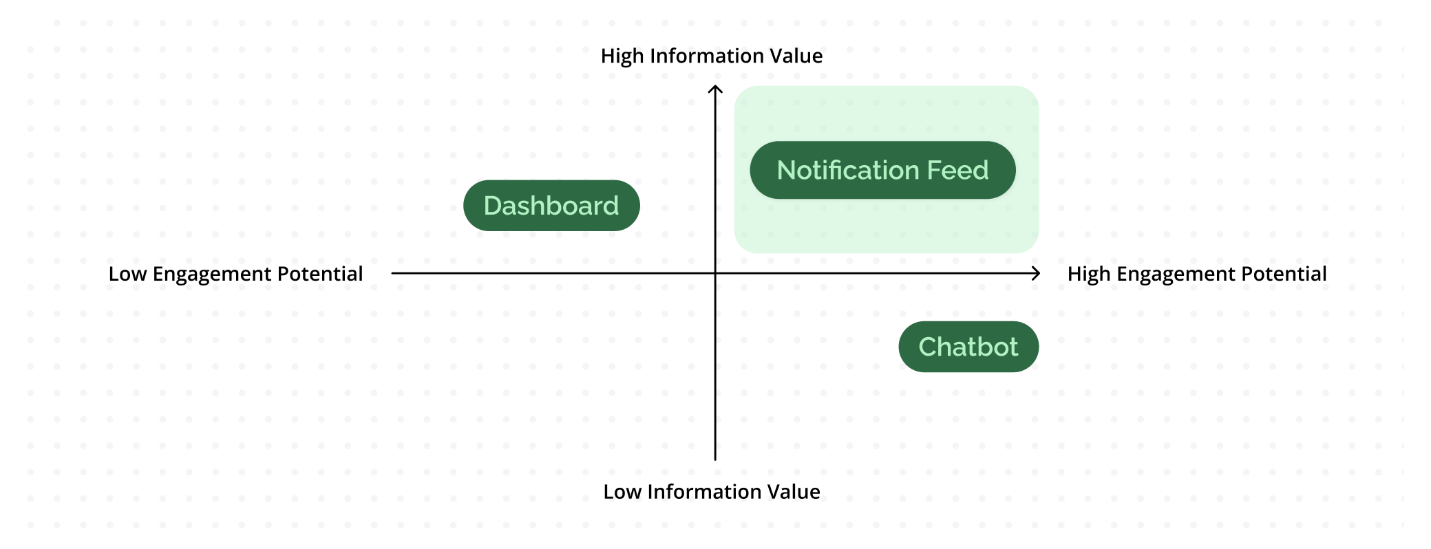
The notification feed stood out in the top-right quadrant, striking the best balance between delivering clear insights and encouraging engagement - That’s why we chose it as our final approach.
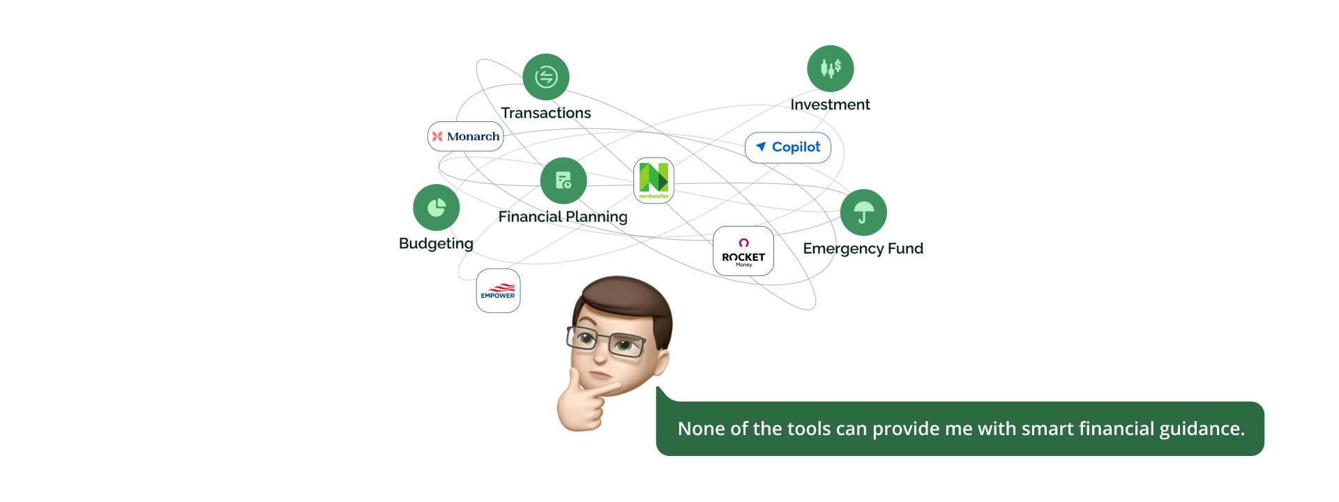
Through user research and early design testing, we realized that financial insights share the same key values as news apps: they require high information density and must be delivered at the right time to feel meaningful.
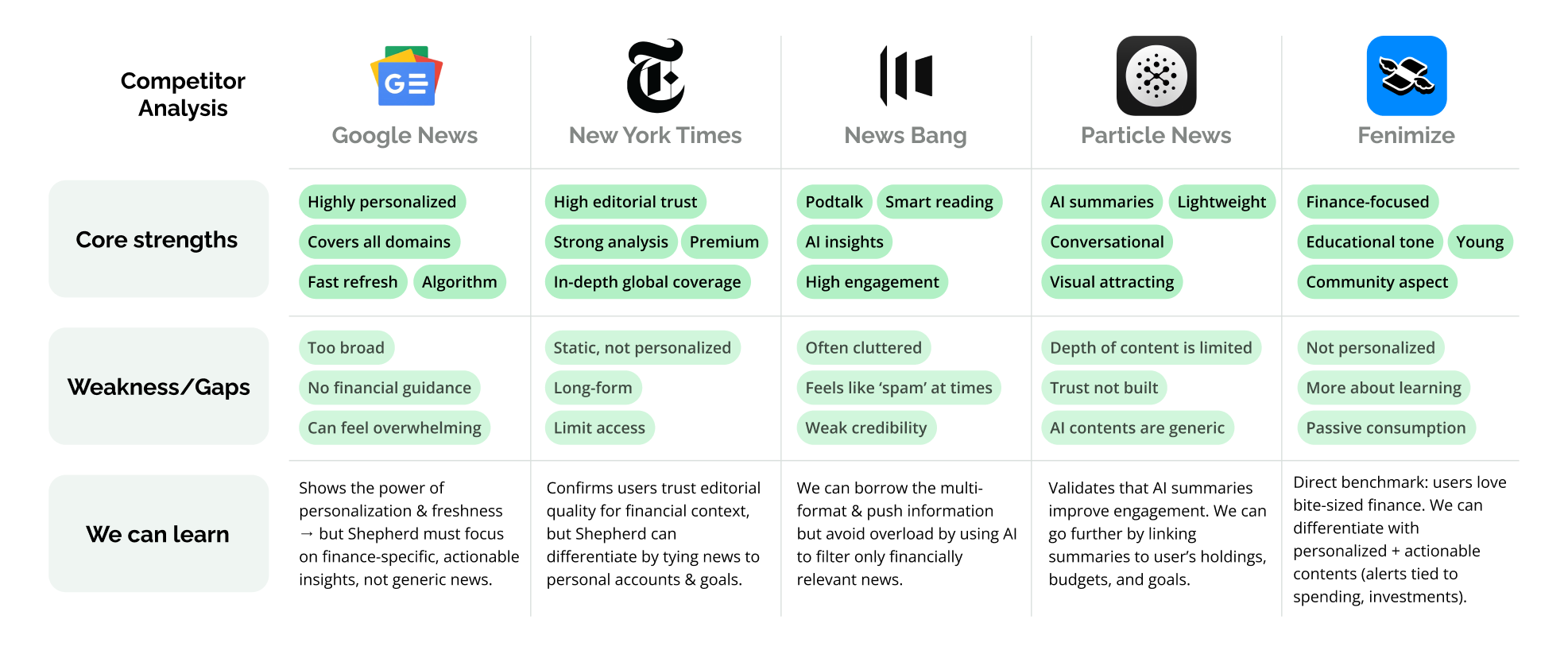
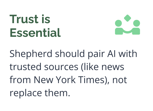
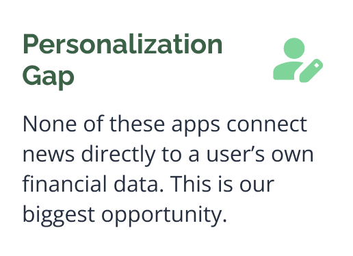
While competitors either deliver general news (Google, NYT), snackable finance (Finimize), or AI summaries (Particle), none connect insights to personal finance data. Our notification feed can bridge this gap by making financial news personal, actionable, and engaging.
With these insights above as a guide, I sketched lo-fi wireframes to shape how notifications might look.
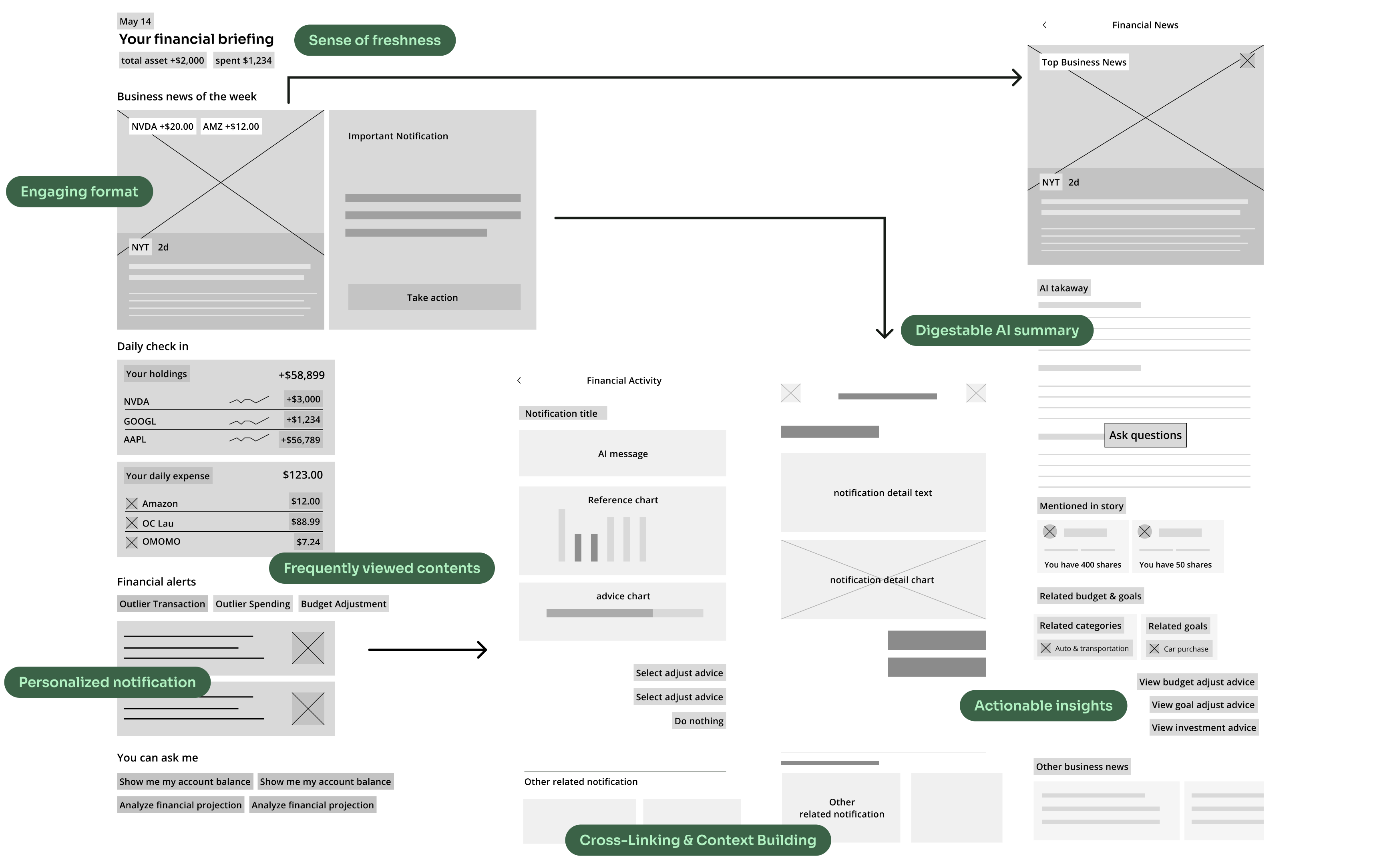
Notifications are our core differentiator, delivering fresh content daily both AI-generated and team-curated. We encourage users to return regularly, discover timely insights, and engage with high-value information effortlessly.
We made notifications the homepage to surface timely, personalized insights upfront—so users always see what matters most the moment they open the app.

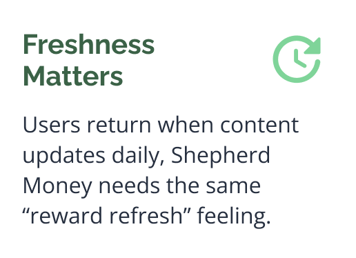
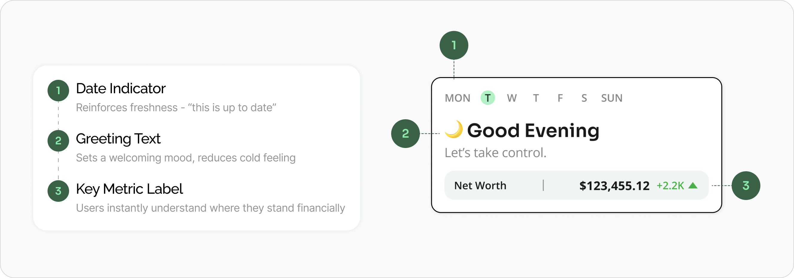
As a finance app, most data doesn’t change dramatically from day to day—so users can lose the motivation to check in. That’s why we created a daily snapshot to highlight what’s different today, give users a sense of progress, and make each visit feel rewarding.
We placed key updates—like business news and important notifications upfront to create visual stimulus and maintain daily engagement.
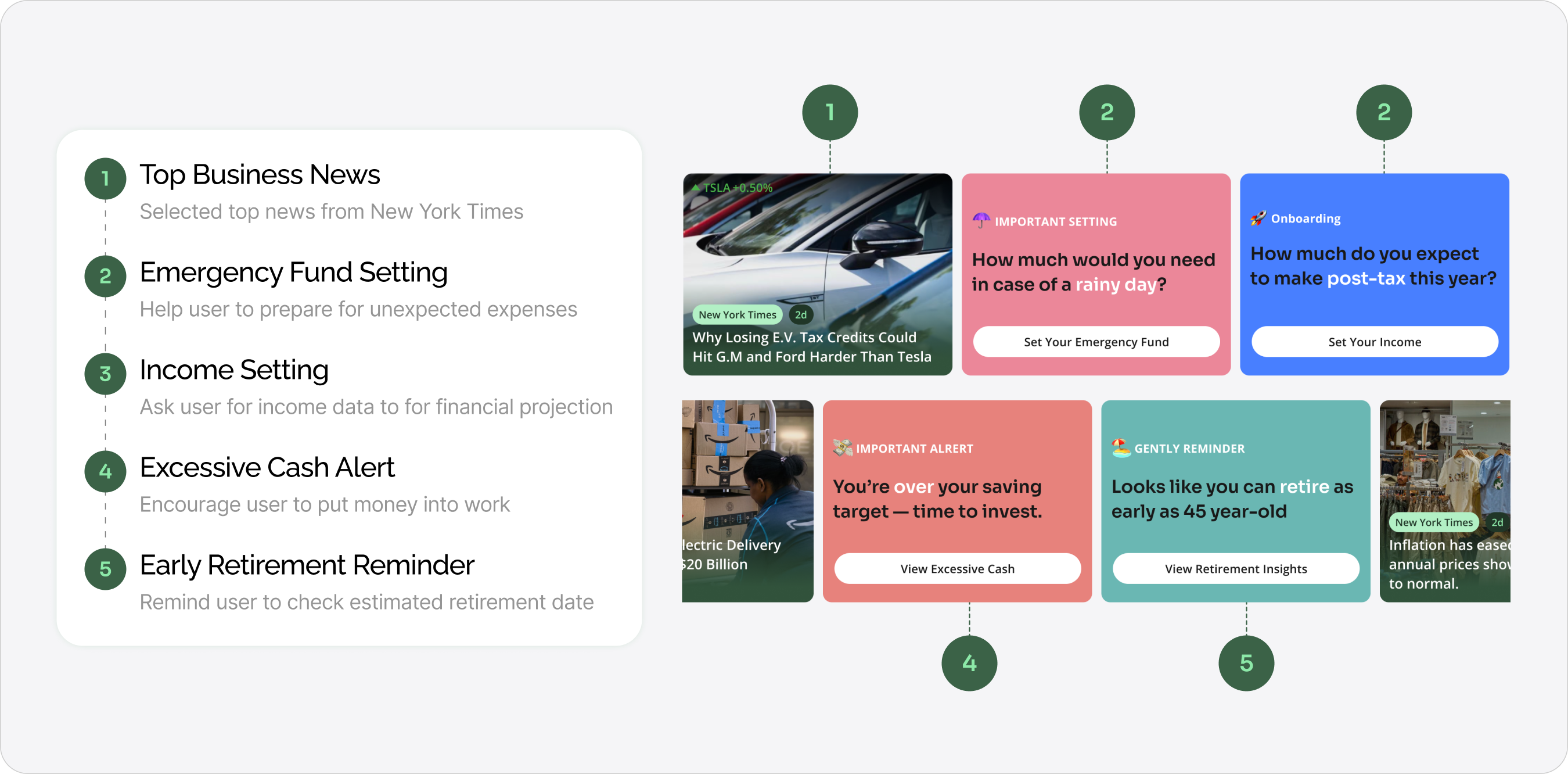
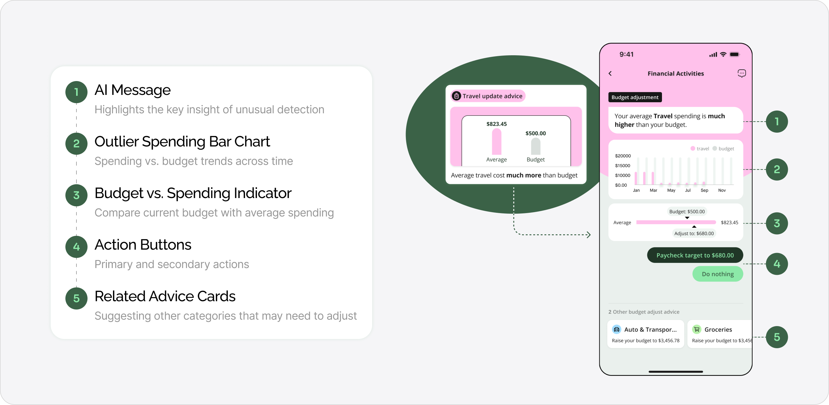
Financial notification is to help users spot what’s worth their attention because most financial data looks the same day to day. These digestible, news-style updates highlight key changes and guide users to deeper insights. Whether it’s a dining overspend alert that leads them to the budgeting page, or a market shift linked to their investments.
As a finance app, most data doesn’t change dramatically from day to day—so users can lose the motivation to check in. That’s why we created a daily snapshot to highlight what’s different today, give users a sense of progress, and make each visit feel rewarding.
As a finance app, most data doesn’t change dramatically from day to day—so users can lose the motivation to check in. That’s why we created a daily snapshot to highlight what’s different today, give users a sense of progress, and make each visit feel rewarding.
Before reaching the final design, we explored multiple directions and refined the solution under both technical and product constraints
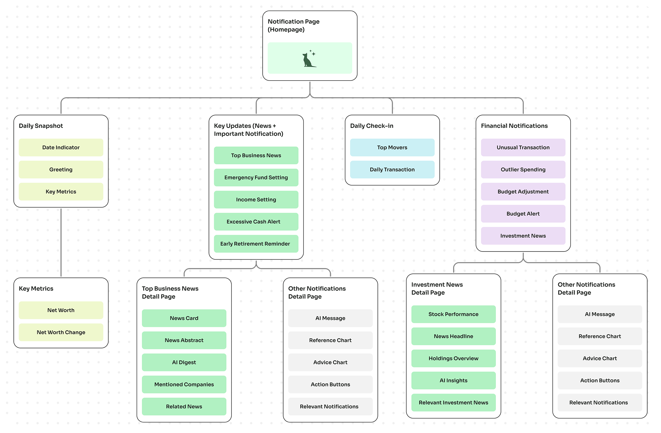
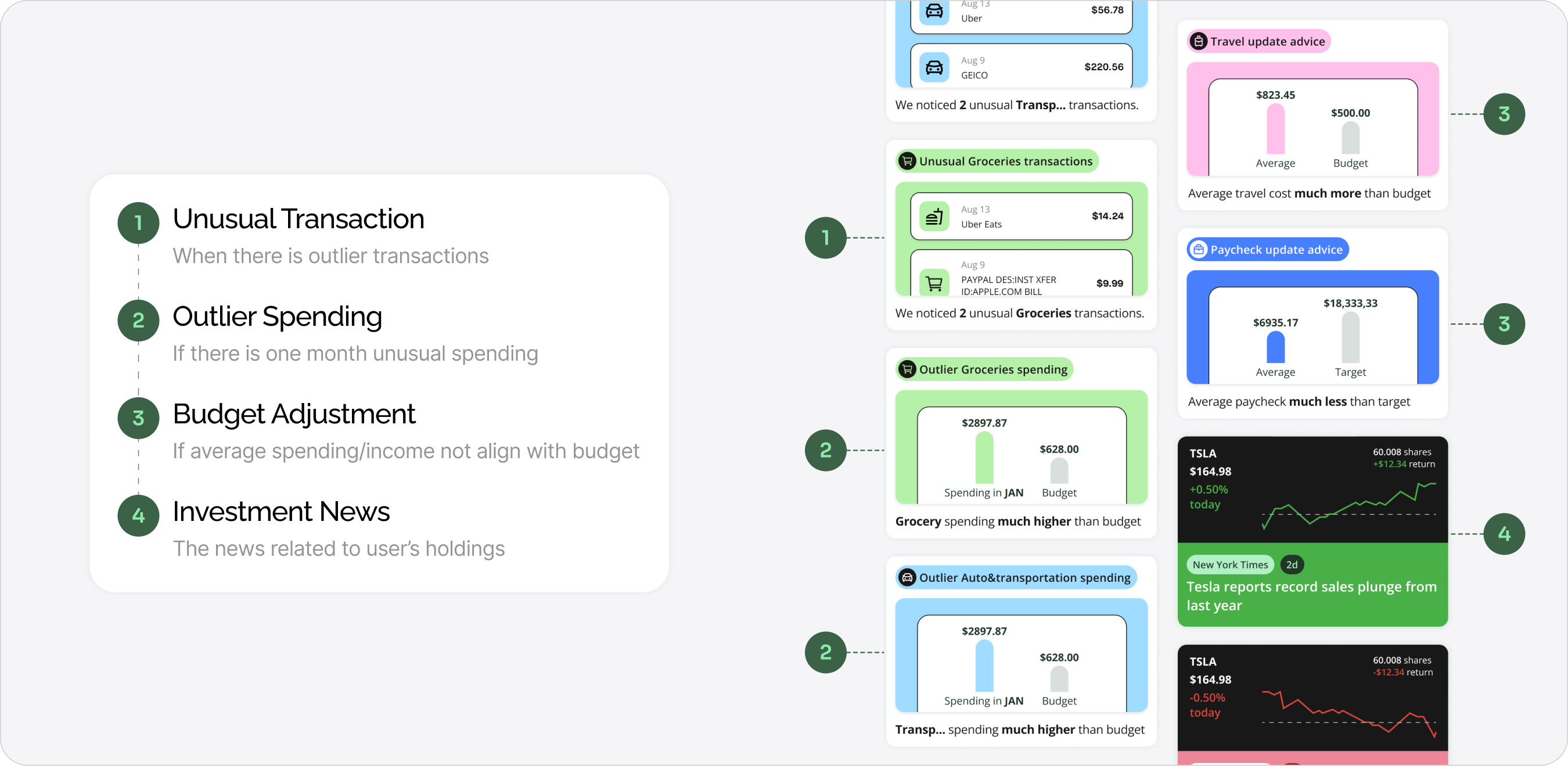
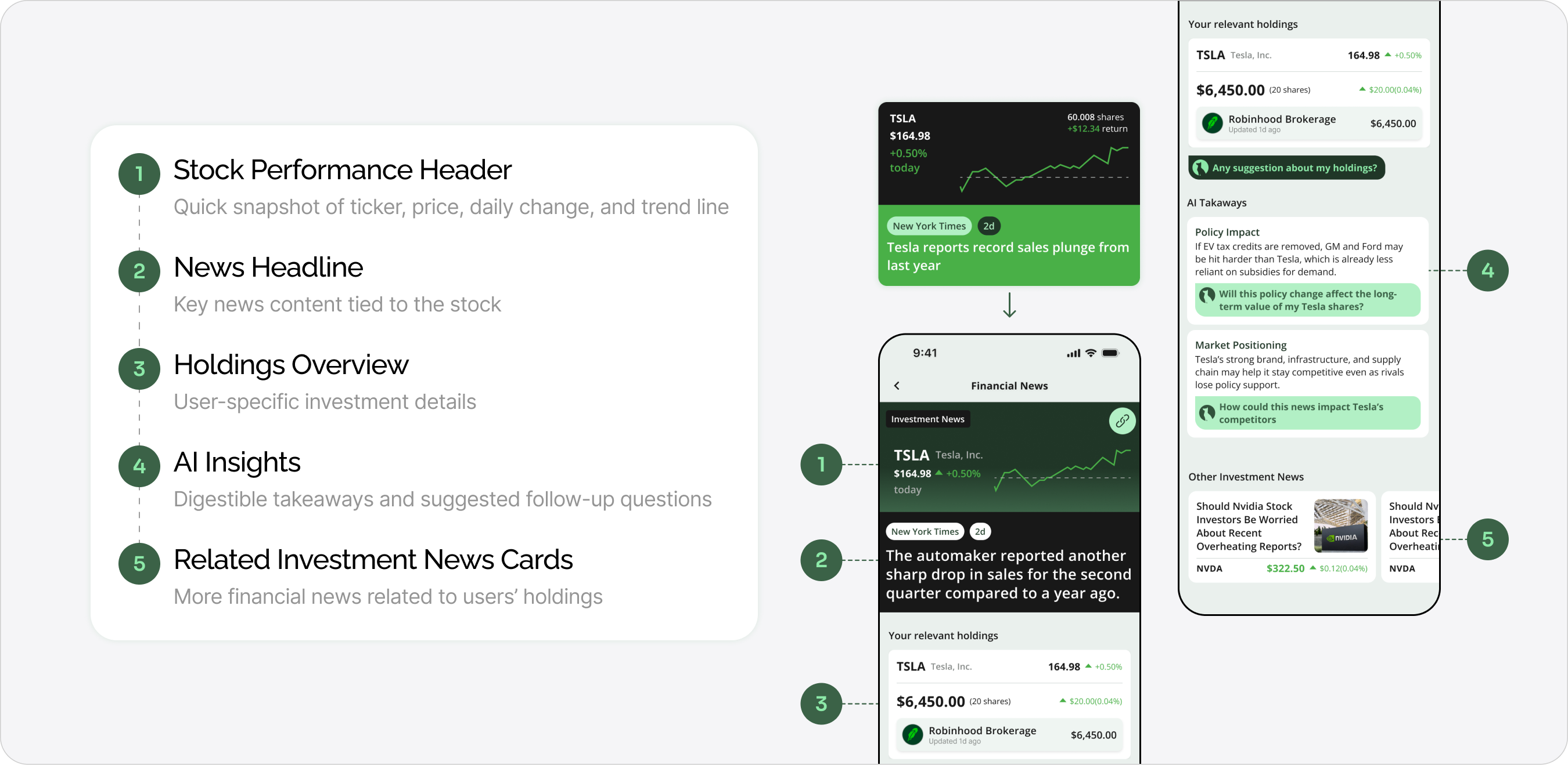
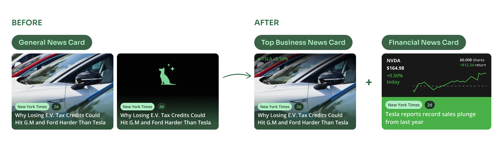
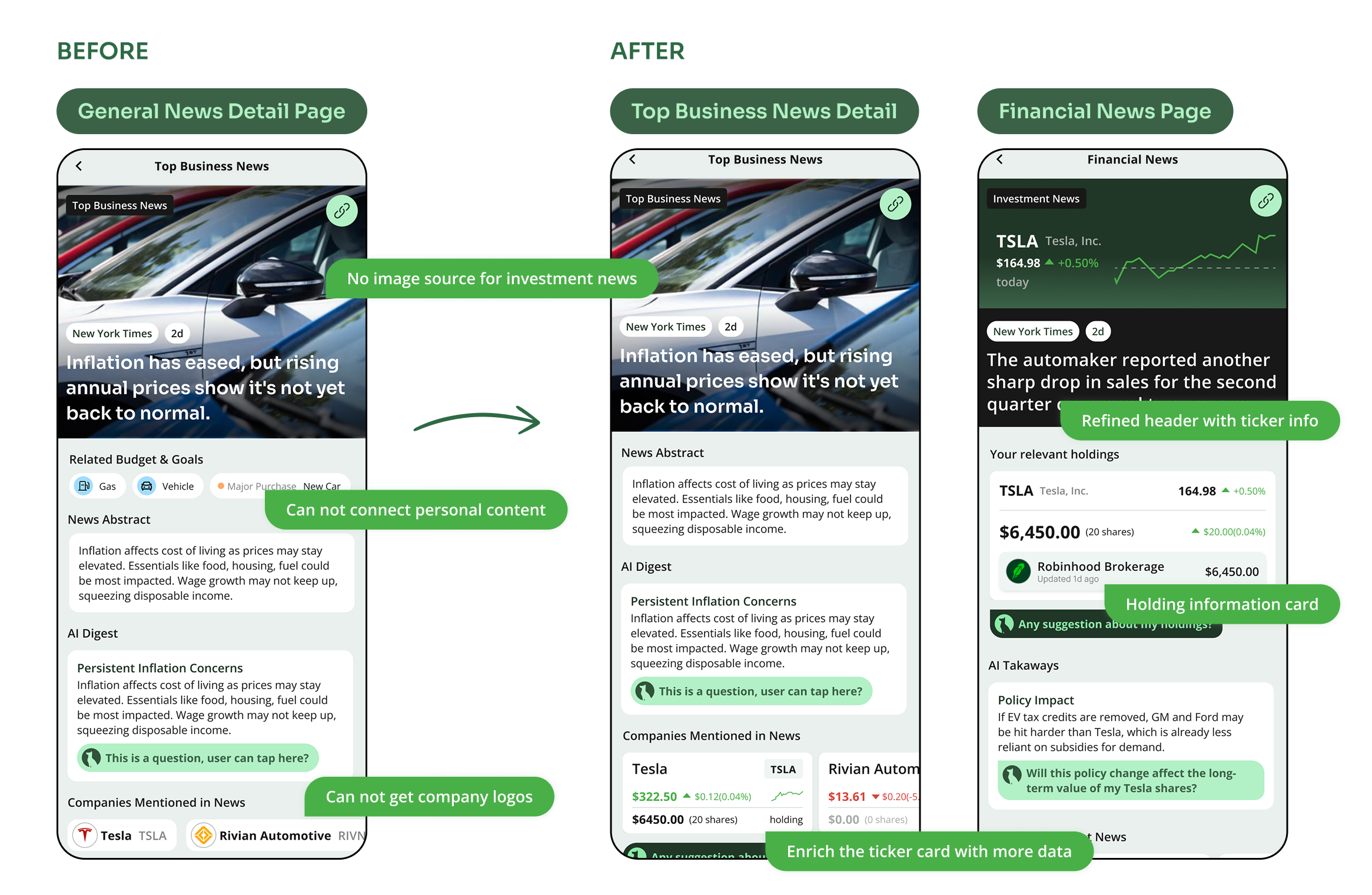
Our content pipeline only provided image assets for top business news articles. For investment news—news tied to user’s personal holdings—we had no reliable images. This created an inconsistency: some cards looked rich and engaging, while others felt empty and less credible. To address this, I designed two separate sets of news cards and detail pages
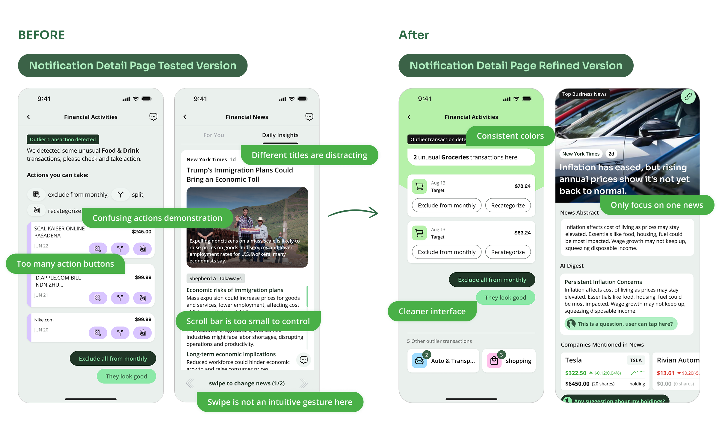
We explored two extreme versions: one that was overly simple, which failed to engage users, and another that was overly complex, which made interactions inefficient. The final design strikes a balance between clarity and engagement.

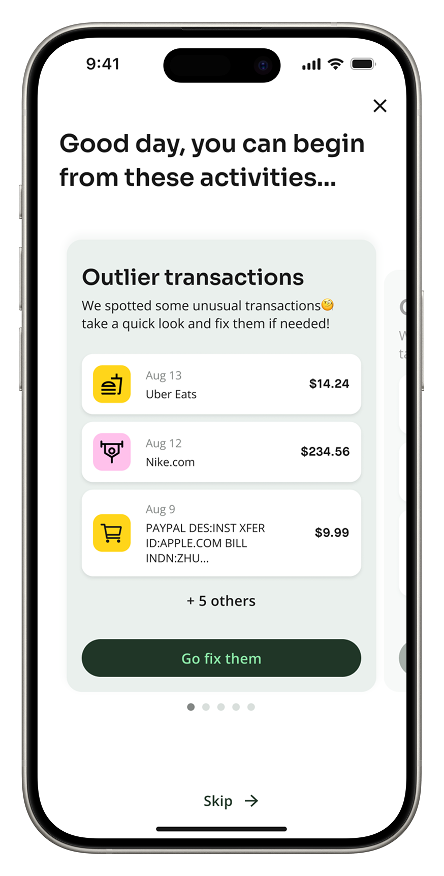
After several iterations with the PM, we introduced a notification onboarding screen that surfaces actionable AI insights immediately after sign-in.
This project challenged me to untangle complexity and in the end, I not only built a smarter tool but redefined what a financial app can feel like when AI becomes considerate and proactive.
Some takeaways: